# Lessons We Learned Implementing a Design System at Kong
Maksym Portianoi
Software Engineer (Core UI), Kong
In this article, we'll talk about our experience implementing a design system at Kong. We'll go over the reasons why we decided we needed one in the first place, where we started, and how we got to where we are today. We'll also cover the technology we used and how it has transformed software development at Kong. Whether you have plenty of experience with design systems or are looking to get started with one, we hope you will find this article helpful and informative.
# Key takeaways
- You know you need a design system when ensuring consistent UX across the platform becomes a bottleneck
- Trying to combine design tokens, UI components, icons, and styles into one library is a very bad pattern — each of those areas requires a separate library
Konnect engineering is organized into specialized teams each owning one or more product areas. The majority of teams have both back-end and front-end developers, some teams have their own designated product designer but most of the time they "share" a designer (one designer could be assigned to a few projects or initiatives across different areas). Teams ship often, new features are sometimes released as often as weekly, across the board.
### The turning point: inconsistent UX
Without a consistent design system and a big-picture vision for the platform UI at a fundamental level, the product becomes feature-bloated. It's hard to scale a product that users don't find intuitive and easy to use. For quite some time, Konnect was lacking just that: a clear and definitive vision for the design. Engineers began to accommodate different, often inconsistent designs, resulting in multiple variations of the same component (e.g., two dropdown menus on the same page with very different appearances and inconsistent UX). Eventually, the components used by the design team in Figma started to look different from Kongponents, turning design reviews into trivia nights where engineers had to guess which components to use. Sometimes, these sessions led to engineers adding even more variations to Kongponents to accommodate their use cases. Maintenance of Kongponents was becoming increasingly demanding, and a good UX was becoming something the platform was lacking.
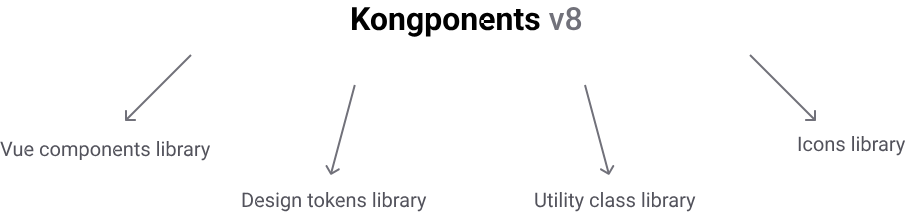
## Pick one thing and be good at it
Redesigning Kongponents would lay the foundation for the whole design system effort. However, before we could simply start using the new and shiny designs our talented design team came up with, we needed to address a few bad patterns we had going on in Kongponents. At the time Kongponents was at v8 and it was the literal Frankenstein. Kongponents v8 was simultaneously:
- A Vue components library
- Design tokens library: Probably an overstatement but as close to the truth as it gets, as it exported a few CSS custom properties and SASS variables for our most used colors, spacing values and font sizes at the time.
- Utility class library: Again, a very loud term to call what in fact was a couple dozen of common use-case classes.
- Icons library
The very first thing we did was remove usage of all Kongponents-provided utility classes, CSS custom properties, and SASS variables from all consuming repos.
To ensure no one accidentally uses outdated utility classes, we created a custom ESLint plugin to catch any occurrences in the code. **We found that automation is the most effective way to combat anti-patterns.**
Naming is hard. After hours of research and back-and-forth on which convention to follow, we finally agreed on a naming structure. I won't delve too deeply into token naming, as it deserves an article of its own.
The design team owns the design tokens and decides when and what tokens to add based on the needs of the design system.
Enforcing the correct token usage in code, however, is the engineering team's responsibility. We quickly figured that it's only a matter of time before someone accidentally misuses a token or two:
/* incorrect, kui-space-* token does not belong in font-size property */.service-card-description { font-size: $kui-space-20;
}/* correct */.service-card-description { font-size: $kui-font-size-20;
}
There are multiple reasons why it's a bad idea to combine component UI library with icons library:
- Separation of concerns
- Bundle size: Even with tree-shaking, ideally we wanted to have full control over package size
- Ease of switching: Should we decide to use some other icons library tomorrow, we don't want to have to do a breaking Kongponents release just for that
- Maintenance overhead
We created a separate library for icons. Replacing all existing usage of icons across the entire app at once would have been a massive effort so instead we decided to do it proactively while the Kongponents were in the process of reskinning. We would:
- Ask designers and engineers to only use new icons when working on new features
- Try to catch any usage of deprecated icons during pull request review and ask the author of the PR to replace old icon with a new one
- Add new icons to the new library on-demand
After a few months, we only had a handful of old icons left in the entire codebase.
## Kongponents reskin
At first, we were planning to only do what was necessary to give the components a new look and feel and to integrate new design tokens into the styles. However, we realized that with many outdated variations of different components going away, we would need to revisit most of the props and slots in every component. Since doing that practically meant going through each component line-by-line, we decided to also tackle a few code smells that we found along the way. In the end, apart from styling changes, Kongponents v9 includes:
- Accessibility improvements
- Better and more intuitive prop naming
- Consistent and predictable selector naming
- Performance improvements
## Outcomes
The obvious win here is that we've refreshed the look and feel of our entire platform without any downtime in shipping new features. Achieving full 1:1 parity between Figma components and Kongponents guarantees a pixel-perfect design-to-development transition. With our systematic approach to building UIs, there's no confusion about ownership: all design decisions are backed by use cases across our entire design system. In terms of code quality, Konnect is in much better shape than it was at the start of this transition. The developer experience has improved, as each Kongponent now performs the specific tasks it was designed for without needing any style overrides. Most importantly, Konnect users are now enjoying a consistent UX across all product areas.
## Conclusion
Implementation of a design system can't be treated as an event but rather a process. In the future, we'll be dealing with more challenges scaling and solidifying it. However, we're proud of what our team has accomplished so far and value the lessons we learned.
What it is
The Konnect Dev Portal Toolkit is a free extension published by Kong Inc. on the Visual Studio Code Marketplace (ID konghq.vscode-konnect-dev-portal-toolkit) and on Open VSX.
Konnect Developer Portals are how teams publish API document
Adam DeHaven
# Kafka in a DMZ: Protecting AWS MSK with Kong Event Gateway
The MSK exposure problem
Amazon MSK brokers live in private subnets by default. That's the right default. Kafka's protocol wasn't designed for untrusted networks — it has no concept of rate limiting, no built-in field-level encryption, and its ACL
Hugo Guerrero
# How to Set Up Prepaid Credits in Kong Konnect Metering & Billing
The core of this system rests on a foundational principle: currency-specific credit balances are never directly modified. Rather than a simple mutable counter, which is prone to race conditions and opaque manual adjustments, we utilize a comprehensi
Dan Temkin
# How to Test Gateway APIs Directly from Kong Konnect with Insomnia
What You'll Build
To explore the new integration, I'll build a realistic API platform workflow using Konnect, Kong Gateway, and Insomnia.
By the end of this tutorial, I'll have:
A Konnect Control Plane (KongAir Dev)
A local Kong Gateway Data Pl
Juhi Singh
# A Unified Gateway for APIs + Agentic Applications on VMware VKS with Kong Konnect
Built on top of Kong API Gateway, the Kong AI Gateway is designed to address key challenges in enterprise AI adoption. Modern AI applications rarely rely on a single model; instead, they orchestrate multiple GenAI providers, agent frameworks, Age
Anika Suri
# Automating Agreement Workflows with Kong Konnect and Docusign for Developers
Traditional agreement processes were slow and heavily manual. Documents were often created in office tools, shared through email, printed, signed physically, and stored across multiple systems. Tracking the status of agreements required manual follo
Paige Rossi
# Stop Patching. Start Building: The Kong Context Mesh Stack
Your infrastructure already has the raw materials: compute (VMs, containers, serverless), event streaming (Kafka, Kinesis, Pub/Sub, RabbitMQ), data stores (warehouses, databases, object storage), and AI endpoints (any hosted or self-hosted LLM). Tho
Hugo Guerrero
# Local Previews and Agent-Driven Authoring for Your Konnect Dev Portal
What it is
The Konnect Dev Portal Toolkit is a free extension published by Kong Inc. on the Visual Studio Code Marketplace (ID konghq.vscode-konnect-dev-portal-toolkit) and on Open VSX.
Konnect Developer Portals are how teams publish API document
Adam DeHaven
# Kafka in a DMZ: Protecting AWS MSK with Kong Event Gateway
The MSK exposure problem
Amazon MSK brokers live in private subnets by default. That's the right default. Kafka's protocol wasn't designed for untrusted networks — it has no concept of rate limiting, no built-in field-level encryption, and its ACL
Hugo Guerrero
# How to Set Up Prepaid Credits in Kong Konnect Metering & Billing
The core of this system rests on a foundational principle: currency-specific credit balances are never directly modified. Rather than a simple mutable counter, which is prone to race conditions and opaque manual adjustments, we utilize a comprehensi
Dan Temkin
# How to Test Gateway APIs Directly from Kong Konnect with Insomnia
What You'll Build
To explore the new integration, I'll build a realistic API platform workflow using Konnect, Kong Gateway, and Insomnia.
By the end of this tutorial, I'll have:
A Konnect Control Plane (KongAir Dev)
A local Kong Gateway Data Pl
Juhi Singh
# A Unified Gateway for APIs + Agentic Applications on VMware VKS with Kong Konnect
Built on top of Kong API Gateway, the Kong AI Gateway is designed to address key challenges in enterprise AI adoption. Modern AI applications rarely rely on a single model; instead, they orchestrate multiple GenAI providers, agent frameworks, Age
Anika Suri
# Automating Agreement Workflows with Kong Konnect and Docusign for Developers
Traditional agreement processes were slow and heavily manual. Documents were often created in office tools, shared through email, printed, signed physically, and stored across multiple systems. Tracking the status of agreements required manual follo
Paige Rossi
# Stop Patching. Start Building: The Kong Context Mesh Stack
Your infrastructure already has the raw materials: compute (VMs, containers, serverless), event streaming (Kafka, Kinesis, Pub/Sub, RabbitMQ), data stores (warehouses, databases, object storage), and AI endpoints (any hosted or self-hosted LLM). Tho
Hugo Guerrero
## Ready to see Kong in action?
Get a personalized walkthrough of Kong's platform tailored to your architecture, use cases, and scale requirements.