Multiple teams at [Kong](https://konghq.com)Kong have been improving accessibility (also referred to as a11y) across our products. Over the past few months, our [Dev Portal](https://docs.konghq.com/gateway/latest/developer-portal)Dev Portal team has been working on accessibility improvements prompted by the needs of our customers. For example, [financial services](https://engage.konghq.com/finserv/home)financial services and government institutions are required by law to ensure their software meets certain accessibility standards.
In this post, we'll dive into some of the specific things we did to the Dev Portal UI to make it a more inclusive product. We learned some lessons along the way that will help us going forward.
## What Is Accessibility and How Do We Measure It?
Web accessibility refers to things we do to make content more inclusive for individuals using technology with limitations or in alternative ways. Online inaccessibility means the content design is incompatible with how some individuals actually interact with it.
Since accessibility is a broad topic, we scope out changes by measuring our apps and websites against [Web Content Accessibility Guidelines (WCAG)](https://www.w3.org/WAI/standards-guidelines/wcag)Web Content Accessibility Guidelines (WCAG) standards. The scale goes from A to AA to AAA, with AAA being the most accessible.
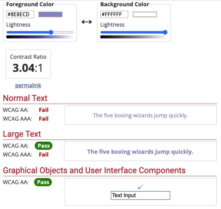
In the following example via [webaim.org](https://webaim.org)webaim.org, we're running a color contrast test. Color contrast is one vital part of accessibility measurement. We input a foreground color to be contrasted with a background color.
As you can see, this specific blue against a white background fails as normal text for AA and AAA color contrast standards. However, it passes for large text and graphical objects under AA standards.

Webaim.org takes a foreground and background color and compares the contrast against AA and AAA color contrast standards.
Some standards are baked into writing clean HTML, which means sometimes creating more accessible UIs is about refactoring. Other standards require more testing and innovative solutions, like tabbing through the generated UI (we encountered this very case within Dev Portal).
## Isolating and Solving Accessibility Issues
On the Dev Portal team, we went in with a goal of creating more A and AA accessibility for the on-prem Dev Portal. The first thing we had to do was learn what was inaccessible on our current UI. For this, we all downloaded the browser extension [AXE](https://chrome.google.com/webstore/detail/axe-devtools-web-accessib/lhdoppojpmngadmnindnejefpokejbdd/related?hl=en-US&utm_term=axe%20extension&utm_campaign=Search%20-%20axe%20DevTools%20-%20Branded&utm_source=adwords&utm_medium=ppc&hsa_src=g&hsa_ad=567862382042&hsa_tgt=kwd-942809057222&hsa_mt=e&hsa_ver=3&hsa_acc=7854167720&hsa_kw=axe%20extension&hsa_grp=122011560887&hsa_cam=12428499999&hsa_net=adwords&gclid=CjwKCAiAl-6PBhBCEiwAc2GOVLguUtKtFAgLYvOeb5O72Per2PXiOpCPF6hNQUgwPCcD_56kC88RhhoCWRMQAvD_BwE)AXE. There are other extensions and [tools](https://www.w3.org/WAI/test-evaluate/#tools)tools out there, but we found the layout of this tool very useful as the output called out the criticalness of a flagged issue.
From there, we did an initial audit and compiled a list of issues to tackle. As we worked through each issue, we continuously ran the browser extension to check in on our overall progress. We eventually got down to zero issues on some pages and AAA issues on others.
### The Specifics
Now that we've gone through the process of isolating and fixing issues, let's get into the specific issues we focused on:
- - Tab indexing through the menu items tabs enables users to navigate the site with a keyboard only
- - Adding labels to input elements enables users to fill out forms more easily
- - Nesting heading levels properly (from H1 cascading down to H5 without skipping levels) to enable screen readers to parse the flow more effectively
- - Breaking down parts into clear, distinct sections to maximize understanding of content flow
- - Heightening color contrast for low-vision and neurodivergent users
Here's the tabbing ability that we implemented:
*In the Dev Portal, engineers can now navigate the side menu and specification through tabbing. *
Notably, some of these updates required us to fork and use our own version of Swagger UI. In this fork, we modified labels and heading levels. While we would have contributed the work to the Swagger UI open source project, we're working off of a slightly older version, so it wouldn't have been useful to other engineers using the most recent version.
### Key Takeaways
Through this process, we took away some notable lessons about accessibility, including:
- - It's easier to implement accessible features from day one rather than having to go back into an older codebase and retroactively fit accessibility on top of our code.
- - We had to be conscious of how our accessibility changes would impact existing users, especially those using custom CSS. We had to make sure their styling wouldn't break when we changed things like header levels. If we had initially built the app with accessibility in mind, we wouldn't have impacted our users down the line with our changes.
- - Accessibility can sound like a tall order, but it's just about being mindful and paying attention to the details that will make all the difference.
Overall, improving the accessibility of our on-prem Dev Portal was rewarding and taught us a lot about things we should keep in mind for the future. Accessibility is a wide-breadth topic, and we were able to tackle some isolated tasks as a team, not only making our product stronger but also giving a lot more people the opportunity to use it.
## Learn More About Kong Dev Portal
With Dev Portal, you can provide APIs as a product to external teams to consume through a customized portal that leverages your existing CRM or repos as the source of truth. [Learn more about this Kong use case](https://konghq.com/solutions/create-a-developer-platform)Learn more about this Kong use case.
If you'd like to try it out, here are a few resources to get started:
## Want to Bring Your Expertise to Kong's Product Team?
We're hiring across our documentation, developer relations, product design and product management teams! [Apply to work with us >>](/careers)Apply to work with us >>


