# Introducing Themes, Page Layouts, and Configurable Navigation for Konnect Dev Portal
Adam DeHaven
Senior Staff Software Engineer, Kong
Konnect Dev Portal now ships with themes, built-in page layouts, and portal-wide navigation configuration, all in one release. You set the structure of your whole portal with a few settings, and a page assembles itself around the layout it picks.
The three work together: a theme frames the portal, a layout shapes each page inside that frame, and the navigation fills the sidebar. Each one is optional, and pages built from components and snippets keep working.
Themes set the shape of your portal
A theme sets the structure of the portal around your pages. You pick one with theme.name in your portal's customization, and it applies to every page at once:
A missing or unknown theme.name renders ocean, the same as it does today, so a typo or invalid theme name never breaks a portal.
Border radius
Corner style is its own setting, so you can adjust the look of any theme. Set theme.border_radius, next to theme.name and theme.colors in your portal's Appearance settings (or through the /customization endpoint), to one of three values:
sharp gives buttons, inputs, cards, and other components square corners.
soft is the standard corner radius.
round uses larger corners on the same components. Code blocks and tooltips have a lower limit, so they stay readable.
Each theme has its own default: mesa is sharp, pebble is round, and ocean and grove are soft. Leave the setting unset to use your theme's default, or set it to override that default. A value the portal does not support falls back to your theme's default. Elements that are meant to be circular keep their shape.
Your component-level and Global CSS loads after the preset, so it always wins.
The five built-in layouts
Within a theme, a layout decides how a page is arranged: whether the left sidebar appears with navigation, how wide the content column is, whether a page header sits above it, and whether a right sidebar is present. You pick one with the top-level layout property in a page's front matter:
## yaml
---title:"Quickstart"layout:"guide"# One of "guide", "reference", "wide", "center", "custom"---
Layouts work in every theme. The names, front matter, sidebars, and header are the same everywhere, and the theme only changes how they are framed.
If you exclude the layout property, or name a layout that does not exist, the page renders with custom as the default.
Guide
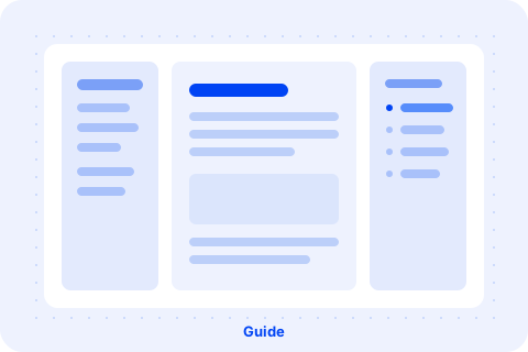
Perfect for most documentation pages. guide is the three-column shape readers recognize from the docs they use every day: navigation on the left, a table of contents on the right, and your content between them. Use it for long-form documentation and guides.
Guide layout: navigation on the left, content in the center, table of contents on the right
Reference
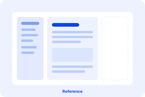
Some pages do not need a table of contents. reference is guide with the right sidebar excluded, but the space it would occupy stays reserved. Use it for a short conceptual page that should keep the same horizontal position as the rest of your content.
Reference layout: navigation on the left, content in the center, no right sidebar
Wide
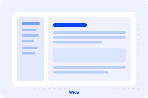
A wide table or a generated API reference needs more room than a prose column allows. wide hands the content column the space reference reserves, and it collapses the left column when no navigation applies to the page.
Wide layout: navigation on the left, wider content, no right sidebar
Center
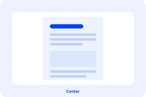
Release notes, changelogs, and articles read best as one column of text with nothing competing for attention. That is center: a single centered column, no sidebars, with a built-in page header.
Center layout: a single centered content column with no sidebars
Custom
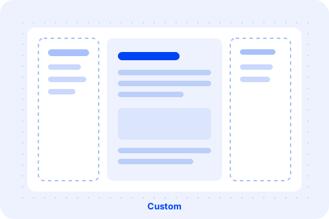
custom is the default, and the escape hatch. It renders the page as you build it: no built-in header or sidebars, and content spans the full page width in every theme. Sidebars are available through snippets. Reach for it for a landing page or a hero-led marketing page, and construct the layout yourself with our [library of components](https://portaldocs.konghq.com)library of components.
Custom layout: freeform sidebars and full-bleed content
A built-in page header powered by your existing front matter, with agent-friendly actions like "Copy page" built in.
The guide, reference, wide, and center layouts render a page header above your content, built from the metadata every page already declares for its SEO, plus one optional property:
## yaml
---title:"Getting started"description:"Everything you need to make your first request."tagline:"Quickstart"layout:"guide"---
title renders as the page's h1.
description renders below the title.
tagline is optional. It renders as a short label above the title.
The header uses metadata you already write, so there is nothing new to author. If your Dev Portal has enabled AI features, agent-friendly actions will also be available in the header. If a page's body already opens with its own title heading or a ::page-hero block, the header renders that content a second time. Remove the hand-authored title or hero, and start the body at a level two heading.
Replace or hide the sidebars and header
The left sidebar, right sidebar, and page header of any layout can each be replaced with a snippet named in the layout-options front matter property, or hidden by setting them to false:
Each value is the name of a snippet, and its content renders where the built-in content was, at the same width.
The title in a snippet's front matter sets the label of the sidebar toggle button on smaller screens.
Naming a snippet for header replaces the whole built-in header.
To hide a page's sidebar-left, sidebar-right, or header, set the corresponding property to false. The layout renders nothing there: no built-in content, no snippet, and no drawer toggle on smaller screens. A wide page whose body opens with its own ::page-hero, for example, can drop the built-in header:
Hiding a sidebar or the header removes its content, and the layout keeps its shape. On guide and reference, the content column stays in place.
Which of these a page can set depends on its layout:
On custom, a sidebar renders only the snippet named for it, since there is no built-in content to replace. On every other layout, the snippet replaces the built-in content. You cannot add a sidebar or header a layout does not have. When a value is invalid, the browser console lists what the layout supports.
Note: If you used the earlier preview of this property, layout-options was previously named page-layout. The old name still works but logs a deprecation warning, so rename it in your existing pages' front matter.
Configure navigation for the whole portal
The guide, reference, and wide layouts reserve their left sidebar for your portal's navigation. You define it for the whole portal, through the /v3/portals/{portalId}/customization/navigations endpoint, and every matching page on those layouts picks up the part that matches its route.
Most portals use one of two shapes:
One menu for the whole site. A single entry claiming / describes every link group, and the same navigation renders on every page whose layout includes a left sidebar.
One menu per top-level section. Entries claiming /getting-started and /guides each describe their section's menu.
A navigation entry claims routes and describes the menus to show on them:
show_on_path_prefixes is the array of route paths the entry claims, such as ["/guides"]. List several paths in one entry to share a menu across sections, or use "/" for an entry that applies wherever no more specific entry matches.
name identifies the entry in the configuration.
groups render as link groups. Each has an optional header and its links.
links each carry a text and an href. A link can nest children up to three levels deep, can render expanded initially, and can set external to open in a new tab.
When a visitor lands on a route, the entry with the longest matching show_on_path_prefixes prefix wins, and its groups render in the left sidebar.
Clearing the navigation for a section
You may desire hiding the navigation for a section entirely. To clear the navigation for a section instead of replacing it, configure an entry that claims the section's path and pass an empty array as its groups:
The entry claims the path and all of its child routes, so no navigation renders there, even when a broader entry such as / also matches. On guide and reference, the empty sidebar leaves the content column in place. On wide, the empty column collapses.
A dedicated navigation for the /apis area
The pages that lead into your API documentation, the APIs list and each API's landing page, can carry their own entry. A visitor there is shopping for APIs rather than reading a guide, so the /guides menu rarely fits. Without a dedicated entry, these pages render the same navigation as the rest of your portal. Instead, display targeted navigation for the /apis section that apply to every API in your catalog.
The longest-prefix rule takes over those routes automatically.
Documentation and spec pages keep their own sidebar. /apis/{slug}/docs and the spec pages render a purpose-built layout with the API's document list on the left, the document's table of contents on the right, and a header composed from the document's own metadata. Configured navigation does not replace them, though in all themes it shows above the document list.
The catalog filter needs a left sidebar. The APIs list takes layout like any other page, and its filter renders in the left sidebar. Any layout with a left sidebar (guide, reference, wide, or custom) gives it a home. center does not, and neither does a page that sets sidebar-left to false.
Rolling out to an existing portal
Themes, layouts, and navigation arrive together, and each is opt-in. Existing pages render with custom layout, and an unset theme renders ocean, so you can adopt each piece on its own schedule. The border radius setting is optional too: when theme.border_radius is unset, your theme's default applies. Pick the pages that read best as a guide or a reference, set their layout, drop the hand-authored title or hero from the body, and move on. The navigation configuration and the theme are independent of that migration, so you can define menus or switch themes before, during, or after.
A reasonable order is to configure your navigation, move your main documentation pages to guide and reference, and then try a theme to see how the whole portal reads. Switching back is a single setting.
Replacing a built-in header or sidebar with a snippet means taking responsibility for what that header or sidebar renders, on every page that names the snippet.
**1. Does Kong Dev Portal support custom themes?**
Currently, Konnect Dev Portal does not support building fully custom themes from scratch. However, you can deeply customize the four built-in themes (`ocean`, `mesa`, `grove`, and `pebble`) by configuring `theme.border_radius` and using Global CSS to override specific elements.
**2. Why is my Konnect page title appearing twice?**
If your page title is duplicated, it is likely because you are using a built-in layout (like `guide`, `reference`, `wide`, or `center`) that automatically generates a page header from your front matter, while your page body also includes a hand-authored `# Title` or `::page-hero` block. To fix this, remove the hand-authored title from your page body and start your content with an H2 (`##`).
**3. How do I make a navigation link open in a new tab?**
To force a navigation link to open in a new tab, add the `"external": true` property to the specific link object within your `/customization/navigations` JSON payload.
**4. Why does hiding a sidebar leave blank space beside my content?**
If you set `sidebar-left: false` or `sidebar-right: false` on the `guide` or `reference` layouts, the layout will hide the content but maintain its structural shape, leaving blank space. If you want your content to expand horizontally when a sidebar is empty, use the `wide` layout, which automatically collapses the left column if no navigation applies.
**5. Why is the API catalog filter missing from my portal?**
The API catalog filter requires a left sidebar to render. If your APIs list page is using the `center` layout, or if you have explicitly set `sidebar-left: false` in your front matter, the filter will not appear. Switch the page to `guide`, `reference`, `wide`, or `custom` to restore the filter.
**6. Is **`**page-layout**`** still supported in Konnect Dev Portal?**
Yes, `page-layout` is still supported for backward compatibility, but it is deprecated. You will see a deprecation warning in your browser console. You should migrate existing pages to use the new `layout-options` front matter property instead.
Your developer portal was built for a developer scanning docs in a browser: reading a page, copying a curl command, moving on. Increasingly, the thing reading those docs isn't a person. It's an agent, working through an API integration on someone's
Nathanael Shermett
# New MCP Support Across the Entire Konnect Platform
Bridging the API (and API access) gap between AI coding tools, agents, and the APIs that they “eat” Data might be the fuel for AI. But APIs are the proper way to package that “fuel” as AI-ready “food” is through the API. AI coding tools can do a lot
Alex Drag
# Build Reuse into Your API Program with Konnect Dev Portal
The new Kong Konnect Dev Portal is now generally available for all users! In March, we announced the public beta version of our reimagined Dev Portal. We set out to fully address the needs of the modern API consumer as well as the needs of the moder
Erin Choi
# Kong's New Developer Portal: Modern UX Meets Developer Self-Service
We just GA’d the new Kong Konnect Developer Portal as part of our broader API discovery initiative , and it represents a fundamental rethink of what a developer portal should be. Built from the ground up on a modern tech stack, it delivers both the
Michael Field
# New Enhancements to Konnect to Fuel API-Driven Innovation
APIs are the lifeblood of disruption . . . when leveraged correctly. The best, most disruptive businesses are able to harness API growth as a strategic opportunity. But how? With an API platform that drives innovation, faster delivery, and top-tier
Erin Choi
# Kong Konnect Adds Portal RBAC API, OAS Validation Plugin
Wondering what’s new in Kong Konnect ? In this roundup, we’ll highlight some of the new capabilities and expansions in Kong Konnect, including portal role-based access control (RBAC) API, OAS validation plugin, and support for Kong Gateway 3.2. R
Ishwari Lokare
# New in Kong Konnect: Support for Okta + More Portal Customization
In February 2021, we announced the GA of Kong Konnect , the first cloud native service connectivity platform that gives organizations the flexibility of protecting their API and service traffic while simultaneously taking advantage of 10x ops impro
Christian Heidenreich
# Kong Introduces the Portal MCP Server for Developer Portal
Your developer portal was built for a developer scanning docs in a browser: reading a page, copying a curl command, moving on. Increasingly, the thing reading those docs isn't a person. It's an agent, working through an API integration on someone's
Nathanael Shermett
# New MCP Support Across the Entire Konnect Platform
Bridging the API (and API access) gap between AI coding tools, agents, and the APIs that they “eat” Data might be the fuel for AI. But APIs are the proper way to package that “fuel” as AI-ready “food” is through the API. AI coding tools can do a lot
Alex Drag
# Build Reuse into Your API Program with Konnect Dev Portal
The new Kong Konnect Dev Portal is now generally available for all users! In March, we announced the public beta version of our reimagined Dev Portal. We set out to fully address the needs of the modern API consumer as well as the needs of the moder
Erin Choi
# Kong's New Developer Portal: Modern UX Meets Developer Self-Service
We just GA’d the new Kong Konnect Developer Portal as part of our broader API discovery initiative , and it represents a fundamental rethink of what a developer portal should be. Built from the ground up on a modern tech stack, it delivers both the
Michael Field
# New Enhancements to Konnect to Fuel API-Driven Innovation
APIs are the lifeblood of disruption . . . when leveraged correctly. The best, most disruptive businesses are able to harness API growth as a strategic opportunity. But how? With an API platform that drives innovation, faster delivery, and top-tier
Erin Choi
# Kong Konnect Adds Portal RBAC API, OAS Validation Plugin
Wondering what’s new in Kong Konnect ? In this roundup, we’ll highlight some of the new capabilities and expansions in Kong Konnect, including portal role-based access control (RBAC) API, OAS validation plugin, and support for Kong Gateway 3.2. R
Ishwari Lokare
# New in Kong Konnect: Support for Okta + More Portal Customization
In February 2021, we announced the GA of Kong Konnect , the first cloud native service connectivity platform that gives organizations the flexibility of protecting their API and service traffic while simultaneously taking advantage of 10x ops impro
Christian Heidenreich
# Kong Introduces the Portal MCP Server for Developer Portal
Your developer portal was built for a developer scanning docs in a browser: reading a page, copying a curl command, moving on. Increasingly, the thing reading those docs isn't a person. It's an agent, working through an API integration on someone's
Nathanael Shermett
# New MCP Support Across the Entire Konnect Platform
Bridging the API (and API access) gap between AI coding tools, agents, and the APIs that they “eat” Data might be the fuel for AI. But APIs are the proper way to package that “fuel” as AI-ready “food” is through the API. AI coding tools can do a lot
Alex Drag
# Build Reuse into Your API Program with Konnect Dev Portal
The new Kong Konnect Dev Portal is now generally available for all users! In March, we announced the public beta version of our reimagined Dev Portal. We set out to fully address the needs of the modern API consumer as well as the needs of the moder
Erin Choi
# Kong's New Developer Portal: Modern UX Meets Developer Self-Service
We just GA’d the new Kong Konnect Developer Portal as part of our broader API discovery initiative , and it represents a fundamental rethink of what a developer portal should be. Built from the ground up on a modern tech stack, it delivers both the
Michael Field
# New Enhancements to Konnect to Fuel API-Driven Innovation
APIs are the lifeblood of disruption . . . when leveraged correctly. The best, most disruptive businesses are able to harness API growth as a strategic opportunity. But how? With an API platform that drives innovation, faster delivery, and top-tier
Erin Choi
# Kong Konnect Adds Portal RBAC API, OAS Validation Plugin
Wondering what’s new in Kong Konnect ? In this roundup, we’ll highlight some of the new capabilities and expansions in Kong Konnect, including portal role-based access control (RBAC) API, OAS validation plugin, and support for Kong Gateway 3.2. R
Ishwari Lokare
# New in Kong Konnect: Support for Okta + More Portal Customization
In February 2021, we announced the GA of Kong Konnect , the first cloud native service connectivity platform that gives organizations the flexibility of protecting their API and service traffic while simultaneously taking advantage of 10x ops impro
Christian Heidenreich
## Ready to see Kong in action?
Get a personalized walkthrough of Kong's platform tailored to your architecture, use cases, and scale requirements.